branding From start to finish
McLean Pres approached me to help create a new identity and style for the church--logo, style guide, print collateral, you name it. This project has been a blast to do from beginning to end!
McLean’s logo is made up of a traditional Celtic cross, clearly rooted in their historic heritage but paired with a modern clean typeface in a way that is engaging without being trendy.
I created this style guide to be used by other artists and the web team to create consistent materials.
From there, we worked to create a suite of materials explaining all of the sub-ministries within the church.
“We trusted WaterKress to build
our brand from the ground up.”
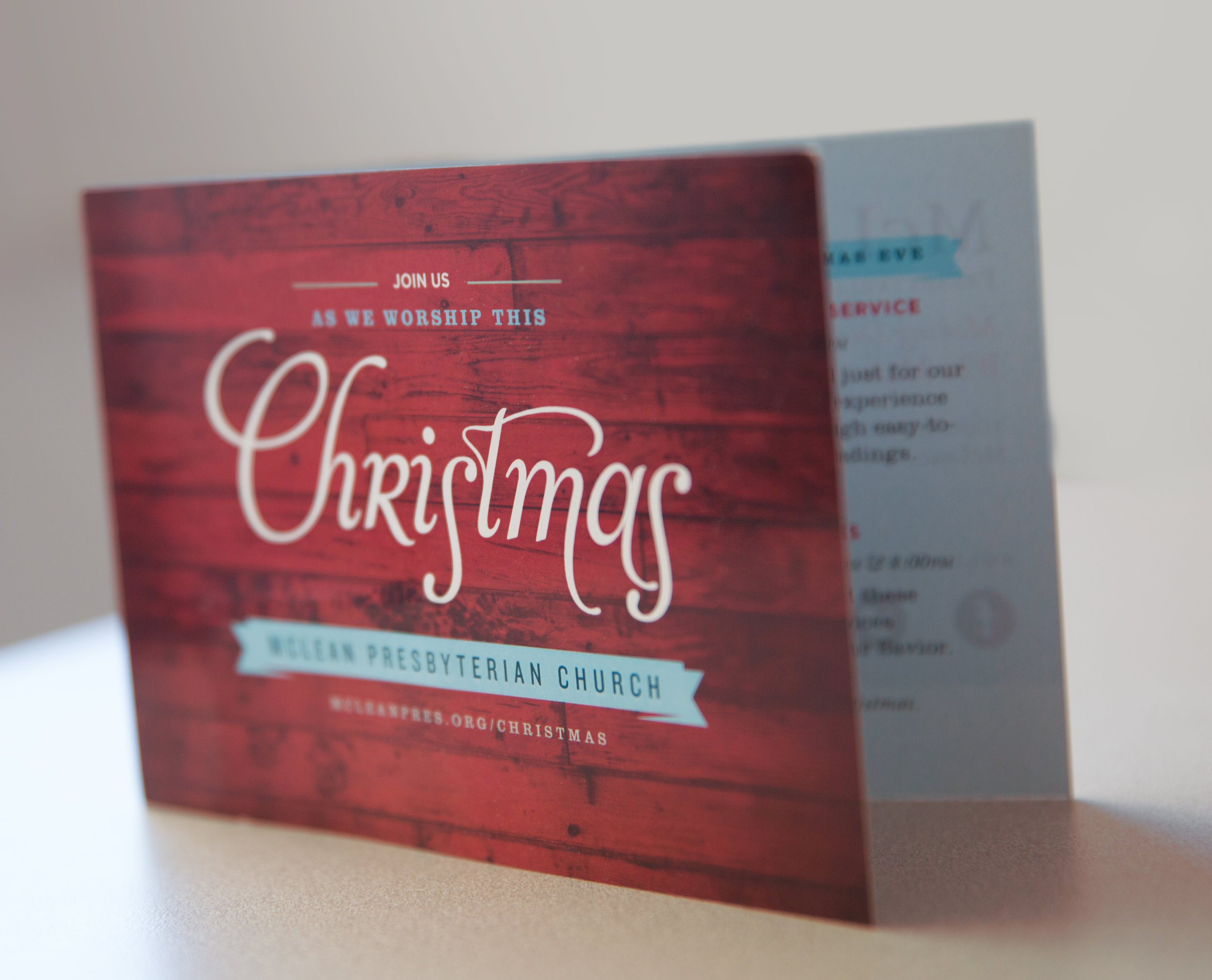
After establishing a strong foundation with fonts and colors, I developed campaigns around different sermon series and holidays. Each event was a chance to explore the palette and aesthetic. Just as the church seeks to embrace the messiness of life with freedom, hope and grace, so the look and feel of the collateral blends grittiness with light. I had a blast developing collateral and web assets while holidng these two visual values in tension.
After the print collateral was created, I was asked to help re-imagine the weekly worship liturgy guide and bulletin. Formerly, it was a large, cumbersome 11x17 booklet with numerous design styles and inserts. We worked to create something on-brand, comprehensive and clear. The final result has reduced waste, production costs and streamlined messaging, creating one folded tabloid-sized booklet for all weekly communications.


